Design Spot: Ahn Sang-Soo
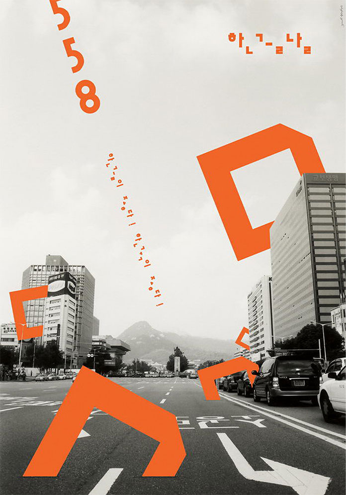
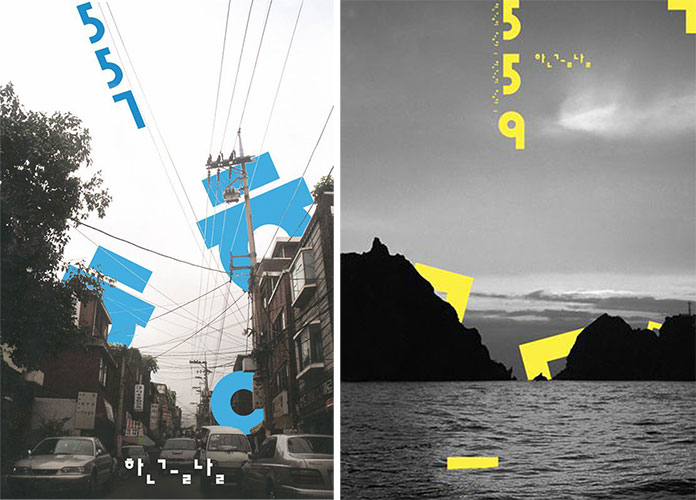
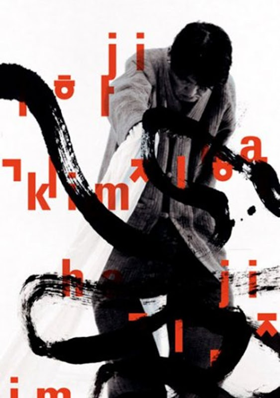

Ahn Sang-Soo’s importance as a designer, especially in the field of typography, cannot be overstated. By manipulating Korea’s 15th century Hangui alphabet into a form that could be used digitally – freeing the characters from the square in which they were traditionally set and creating a number of geometric fonts – he revolutionised graphic design in the country. As well as giving his country the ability to express themselves through design, for which he has been venerated, he has also truly made his own mark as a designer. His typographic led designs are bold, striking and energetically artistic. Very definitely Korean but at the same time with elements of both Swiss aesthetic modernism and Russian Constructivism.
Now in his 60s Ahn Sang-Soo’s career has been varied and illustrious. He was Professor and Head of the School of Graphic Design for over twenty years at the Hongik University in Seoul, he has given lectures across the world. He set up the Paju Typography Institute and in 2010 organised an international typography biennial held in Seoul. He designed and published underground art and culture magazine, Bogoseo/Bogoseo, he translated typography bible Typographische Gestaltung, by Jan Tschichold into Korean, has 15 of his own design related books.
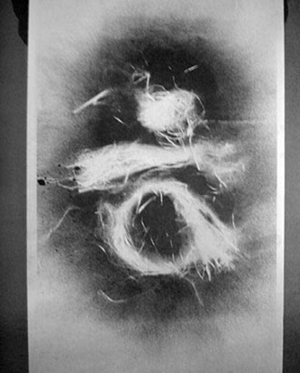
Ahn Sang-Soo now heads up Ahn Graphics Ltd, a graphic design and branding consultancy, which he founded in 1985. He also found time for a personal side project, ‘One Eye’. Sparked off in 1988 with a self portrait of himself covering one eye it has grown into a huge twenty year project with over 30,000 portraits – complete with handwritten calligraphy notes about each subject.
As we said, his importance cannot be overstated. He’s truly a master.
●●
Ahn Graphics Ltd
Ahn Sang-Soo’s website
●●
By Rose Arnold


